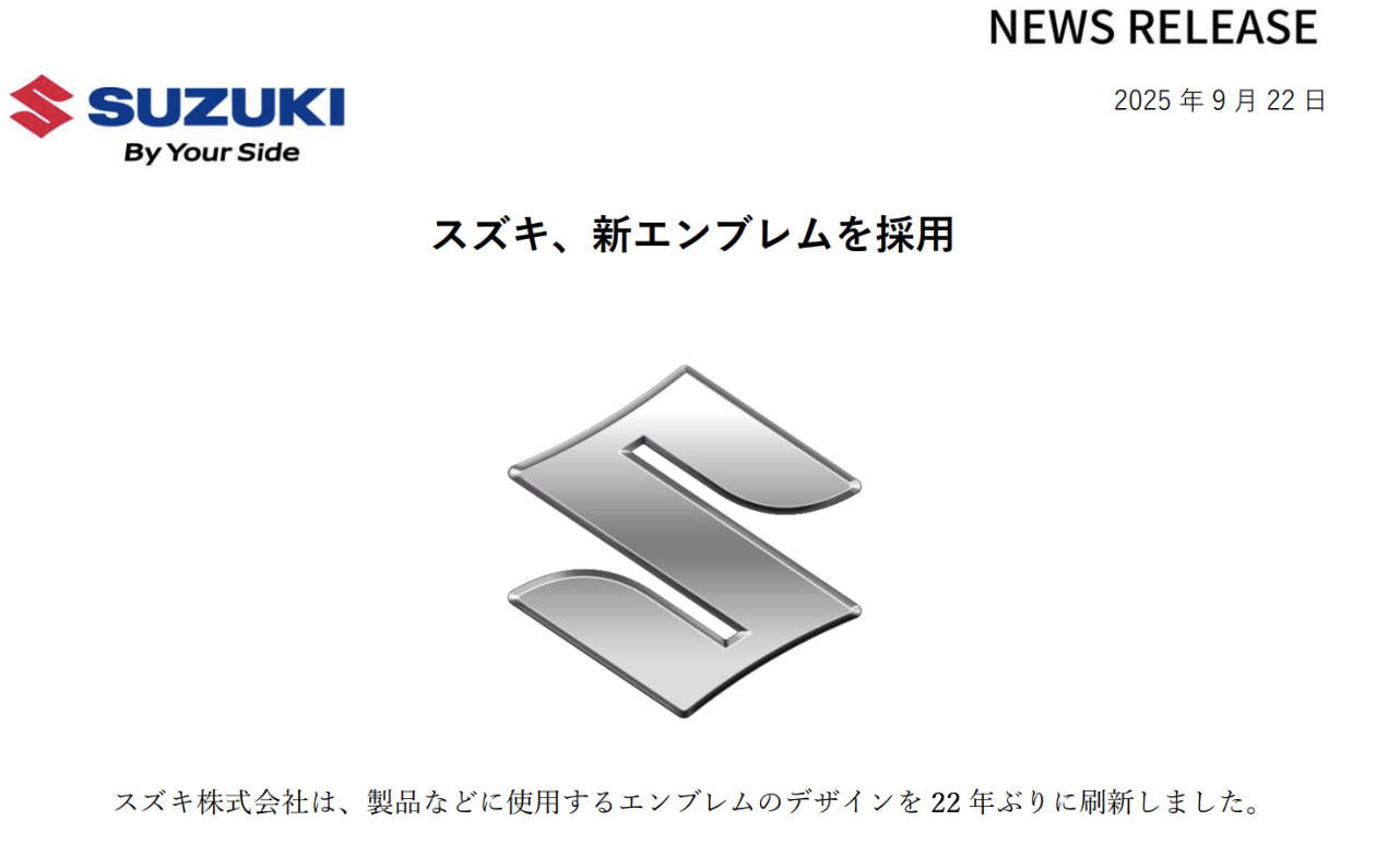
On September 22, Suzuki Motor Corporation announced the official adoption of a new brand logo.
The new Suzuki logo retains the classic “S” shape, which has remained nearly unchanged since 1958, but it has undergone significant adjustments in its details. The new logo eliminates the original chrome outline and refines the edge treatment, while replacing the traditional glossy chrome material with a high-gloss silver resembling matte aluminum. This update gives the emblem a lighter feel. The material used for the new Suzuki logo is also more environmentally friendly compared to its predecessor. This marks Suzuki’s first logo change in 22 years, with the last change taking place in 2003. The new logo will be showcased at the Japan Mobility Show on October 30, 2025.
This logo change comes after 22 years, with the previous change occurring in 2003. Suzuki’s President and CEO, Toshihiro Suzuki, emphasized that the new logo reflects Suzuki’s consistent values, such as creating valuable products from the customer’s perspective, and also demonstrates the company’s determination to face the challenges of the new era.
Suzuki’s predecessor, Suzuki Loom Manufacturing Co., was founded in October 1909 and renamed Suzuki Motor Corporation in 1920. Over its more than 100 years of development, the company’s logo has undergone two major evolutions. In 1958, Suzuki introduced the now widely recognized “S” shape, initially in black and white. The black “S” was placed on a white background, and though it lacked accompanying text, the unique shape quickly established a strong brand identity. In the 1990s, Suzuki added the uppercase sans-serif “Suzuki” text to the “S” symbol and established deep blue and crimson as the standard colors, which continue to be used today.
In recent years, over 40 automotive companies, including major global brands like BMW, Volkswagen, Audi, Nissan, Mazda, Volvo, Kia, Renault, Buick, Chevrolet, General Motors, Opel, SEAT, Fiat, Bentley, and Chinese brands like BYD, Great Wall Motors, Baojun, Beijing Automotive, and Geely, have announced the adoption of flat design logos, creating a new trend in the automotive industry.
In the past decade, more than 40 automotive brands have updated their logos.
As the global automotive industry rapidly moves toward electrification and new energy vehicles (NEVs) gradually become the market mainstream, automotive brands need to convey their electric and intelligent concepts. The simplicity and technological feel of flat logos align well with the smart and tech-oriented concepts emphasized by new energy vehicles.
Young consumers, who have gradually become the main consumer group in the automotive market, have grown up in the digital age, where information spreads quickly. They are curious about new things and seek personalized, fashionable products. Flat logos, with their simple and trendy design style, capture the aesthetic preferences of young consumers and inject youthful energy into the brand. For example, BMW’s new logo has removed the black outer ring, making it simpler and more transparent. This design change has made the BMW brand more approachable and modern in the eyes of young consumers, successfully attracting more attention and affection from this demographic. Many automotive brands, by changing to flat logos, have reshaped their brand image, bringing them closer to young consumers and promoting the expansion and updating of the automotive market’s consumer base, injecting new momentum into the continuous development of the automotive industry.